Simput works with a model definition that must be defined initially. The model is used to describe what kinds of input are needed from the user and how those inputs should be layed out via views.
Format
The model can either be a JSON or a JavaScript file. We recommend using the JavaScript syntax as it will allow you to use comments and avoid other restrictions that JSON enforces.
module.exports = { |
vs
{ |
Model sections
Let’s look closer at the various sections that can exist inside a model.[json/js] file.
Definitions
The definition is the home of a set of attributes.
An attribute is a group of parameters that we want the user to input, with a title/label.
Each parameter is listed in the order it should appear and has the following set of fields:
- id: Identifier that is used inside the attribute map within the view model.
- type: [‘string’, ‘double’, ‘int’, ‘bool’, …] The type is used to properly convert the strings the user inputs to their actual type.
- size: Specifies how many values are required. -1 usually means that the size is dynamic.
- default: Provide a default / initial value
- label [option]: User friendly label for the parameter name which can be provided here, or within the /lang/ directory.
module.exports = { |
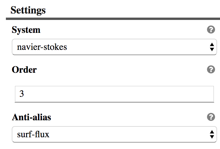
Attribute rendering example
Parameter
Layout
When the size is bigger than 1 it makes sense to provide a layout hint. Below we list the known layout hints and show how they render.
"parameters": [ |
Attribute rendering example
Show
An additional field can be provided to dynamically show or hide a given parameter based on a neighbor’s value.
The value of a parameter is always captured within an array, which force the expression to be extracted like shown below.
"parameters": [ |
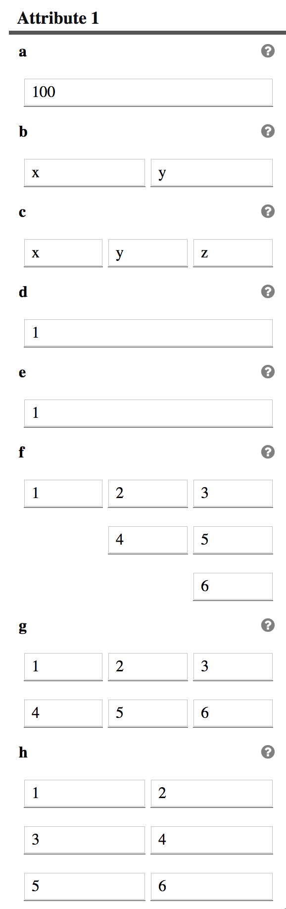
UI
Sometimes a single field needs to have a custom presentation. A ui field is then used to let the user control what presentation layer should be used. Below are some existing ui implementations:
"attr2": { |
Attribute rendering with different ui
{ |
Attribute rendering with different ui
The domain in the UI can be filled by some external data.
{ |
Conditional attributes
Parameters can be dynamically composed based on other attribute parameters and conditional expressions.
"attrOr": { |
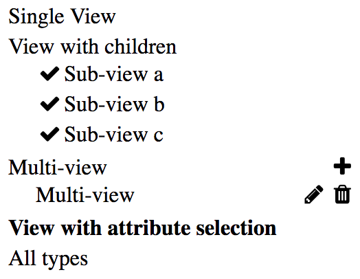
Views
Views are meant to gather several attributes/parameters into meaningful pages that get driven based on a side menu.
The label for a view is what will be displayed in the side menu for selecting a given view/page.
The content of the page will be defined by the attributes array content that was described above.
Instead of attributes, a children array can be used to create a nested list of other views.
A size: -1 is used for a view when you want to dynamically create/delete views in a list.
views : { |
View menu
Hooks can be attached to a view to dynamically massage the data between transitions. This allows, for instance, copying the dynamic view name into a parameter of a given attribute or exposing a set of view data into some external domain so they can be used somewhere else in the input definition.
views : { |
Note the readOnly option disables the view name editing in the side menu which works well if you want to use a parameter to define that view name.
The noDelete option disables the delete action on the view. That flag can either be defined in the view definition or inside the currentViewData that the hooks are getting passed. The ‘readOnly’ flag follows the same pattern regarding where its definition can be provided.
To register your own hooks, create a hooks.js next to your model file. The following listing illustrates what that file should look like.
function getExternal(dataModel) { |
Hooks can also be used to alter the model definition in order to add or remove views in the order list.
Order
The order list is used to define the side menu, providing the list of views in order. A view will not appear unless it is included in this list.
order: [ |
Output
When a convert.js is not provided, additional information can be provided to define what should be generated as output based on the currently defined data model.
output: { |
Currently 2 types are available [default or template]:
- The default mode is just going to serialize the data model into JSON.
- The template mode allow the user to define a Handlebars template to convert the JSON structure into any other format.
The output section requires an additional output field inside each view definition.
Output inside views
On a view which lists a set of attributes, you will need to define an output array that defines a mapping between view attributes and the output data model.
Here is an example:
output: [ |
Each entry in that output array should be composed of:
- extract: list the parameters that we want to output somewhere in the model.
- src: Name of the attribute that we want to extract the parameters from
- dst: List of mapping of where to store the given parameters
The left side of each dst entry defines the path where the parameter on the right side of the =should be stored.
When we want to fill an array with objects the following pattern can be used:
'root.elements[]+=name', |
The . on the left side defines the nesting structure inside an object.
The {xxx} are automatically replaced on the left side with the actual value of the xxx parameter.
Scripts
External scripts can be loaded for a given type by providing at the root level a scripts: [], section with the list of url that the type should load.
This can be useful to register custom widgets to edit your custom parameters.